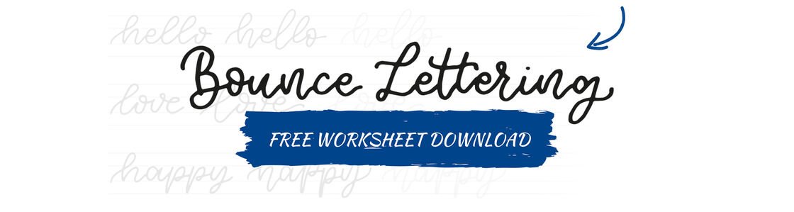
Hand Lettering - Bounce Lettering

Calligraphy, which contrasts thin and thick strokes within letters and words, is particularly popular with hand letterers. The faux calligraphy technique uses simple fineliners to imitate the effect of calligraphy. There are a couple of rules you will need to follow to ensure that your end result looks good! We show you how to conjure up faux calligraphy hand lettering easily using pigment liners.

An article by Lea
When you’re creating traditional hand lettering script, you stick closely to the ascender line, x-height and descender line and your letters don‘t extend beyond them.
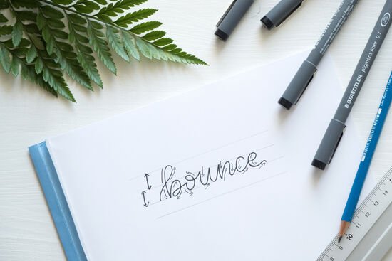
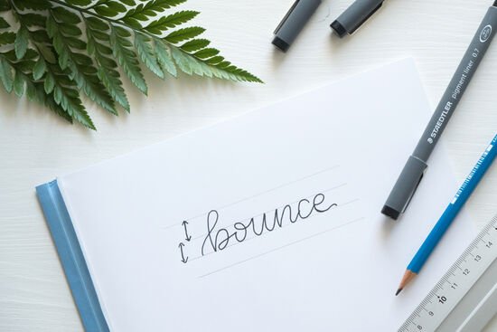
With bounce lettering you let the letters “dance.” To achieve this, it’s important to distinguish between upward and downward strokes, because in the next step you’ll need to take them higher or lower to achieve the bounce effect.
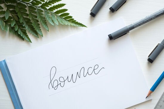
To create the bounce effect, let the upwards and downwards strokes of individual letters extend beyond the guide lines.
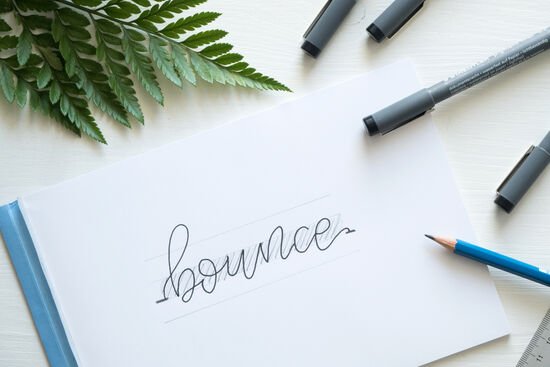
To ensure that your lettering looks good when it’s finished, it’s important that each word is balanced. It’s helpful here to make sure the middle section (the x-height, between the first and third guide lines) is always or mostly full, and that you are only deviating above and below this section.
Material overview


- pigment liner: the thinner the point you choose and the smaller the line width, the more delicate your hand lettering will be. For bounce lettering we recommend a line width of between 0.3 and 0.7 mm.
What you need
| Product | Article no. | Quantity |
|---|---|---|
| Mars® Lumograph® 100 Drawing pencil - Single product HB | 100-HB | 1 |
No time right now?
Save this article as PDF!