- Direct to:
- Products
- Techniques
- Hand Lettering Creator
- FAQs
Which pens are suitable for hand lettering beginners?
The pens are the linchpin of the hand lettering materials. In our tutorial, we show you which hand lettering tools you should have on hand and which fonts you can create with them.
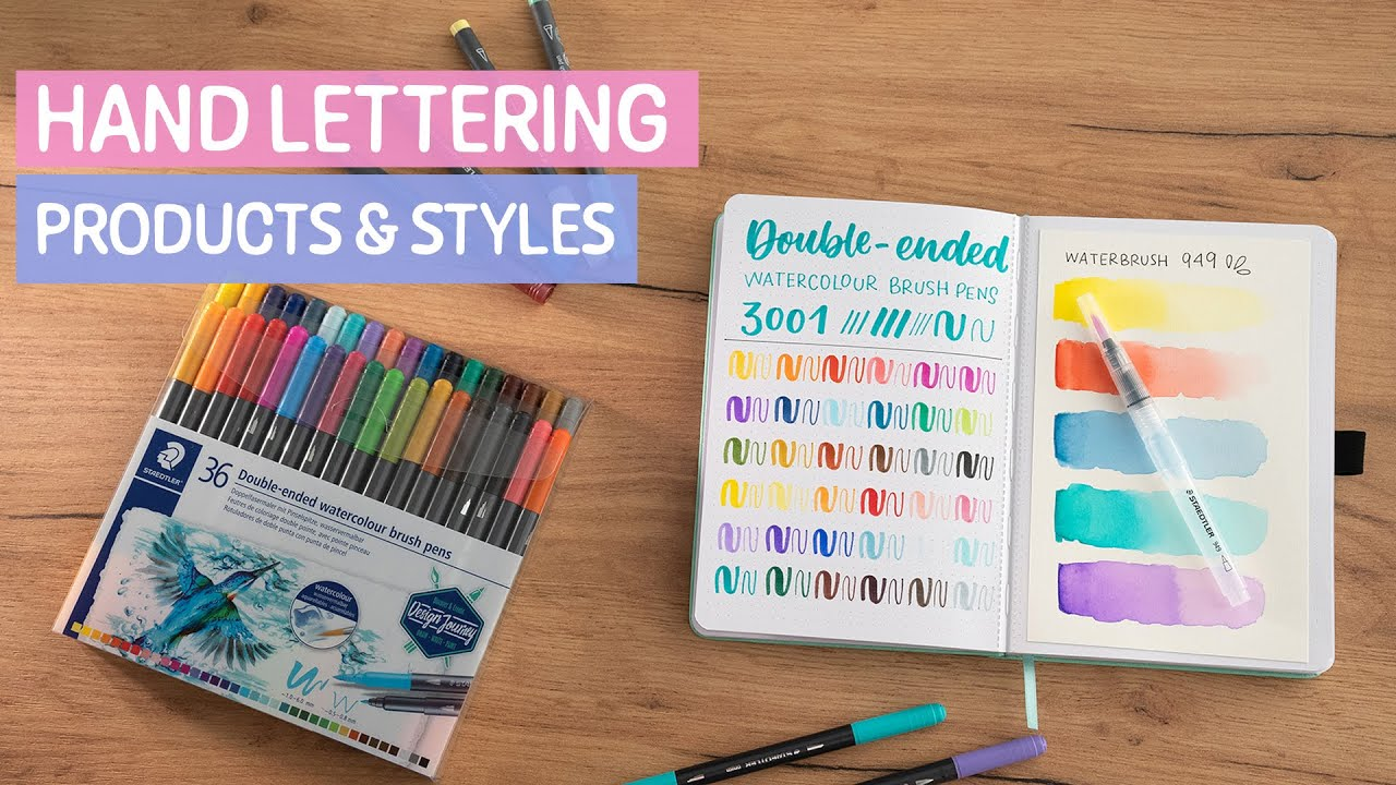
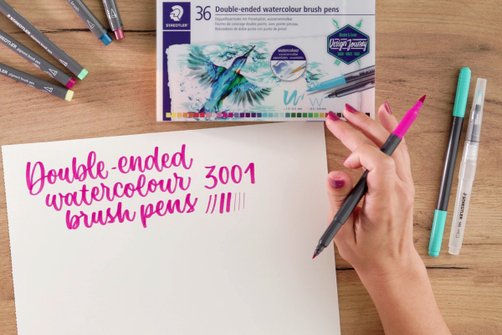
Brush pens are what most people will know best when it comes to hand lettering. These pens are characterised by a flexible tip that is similar to a brush. Depending on how much pressure you apply, you can create finer or thicker lines. If you apply a lot of pressure, the line you draw will be quite thick. Brush pens are therefore ideal for popular brush lettering as well as for some serif fonts as well as sans serif.
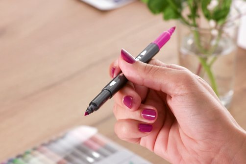
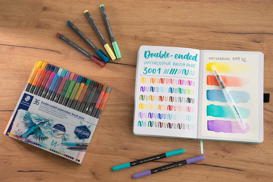
In the STAEDTLER range, you can choose your favourites from a wide variety of different brush pens. Our Design Journey double-ended brush pens 3001 are particularly suitable for hand lettering – even beginners can achieve impressive results with them. This is because the brush tip of the watercolour brush pens have a medium degree of flexibility. This also makes it easier for beginners to control the line width. You can then decorate your letters with the thinner tip.
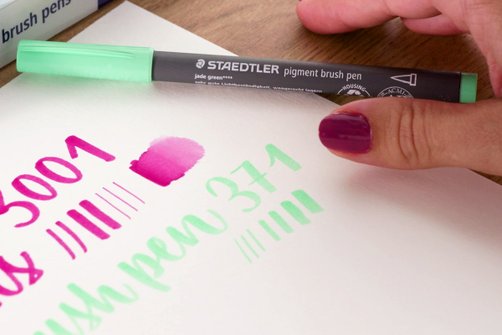
Our pigment arts Brush Pens 371 are just as popular and are an absolute must-have for advanced users. As their tip is more flexible than that of the Brush Pens 3001, you can draw brush strokes in even more variable thicknesses. This results in a high degree of artistic freedom. The waterproof ink contains high-quality pigments that you can use on various surfaces. The innovative Multi Ink it contains is extremely lightfast and offers exceptional colour brilliance.
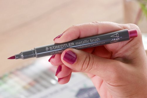
Would you like to write on a dark surface? For unique hand lettering, you can also use the Metallic Brush Pens 8321, which have an enchanting metallic shimmer. In addition to simply having a nice look, metallic brush pens offer numerous application possibilities. In addition to beautiful letterings on light and dark papers or cardboard, you can also use them to decorate surfaces such as glass and mirrors and remove them easily with a damp cloth.
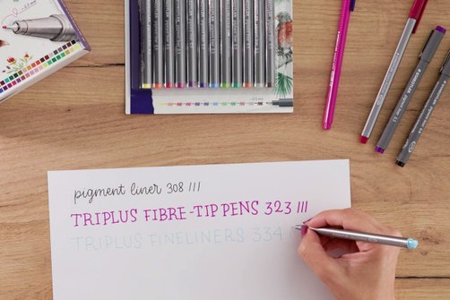
Fineliners are also among the must-haves in your hand lettering pen set. We have two types:
- pigment liner 308 is available in 12 different line widths and 13 colours. The ink is waterproof, so you can use them with watercolour brush pens and watercolours.
- The triplus fineliner 334 is available with a line width of 0.3 mm in up to 60 colours.
Fineliners are a sensible choice if you want to use monoline, faux calligraphy, serif or sans serif fonts. You can also use them to decorate letters and add lines, shadows and small illustrations with the fineliners. Both fineliners and fibre-tip pens are ideal for creating different lettering styles.
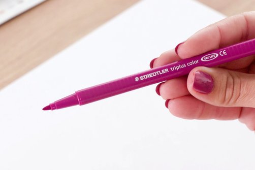
triplus fibre-tip pen 323: Fibre-tip pens are basically felt-tip pens. The paint tip is soaked evenly with ink to paint on paper and cardboard. You can use STAEDTLER fibre-tip pens for serif, sans serif, monoline and faux calligraphy fonts.
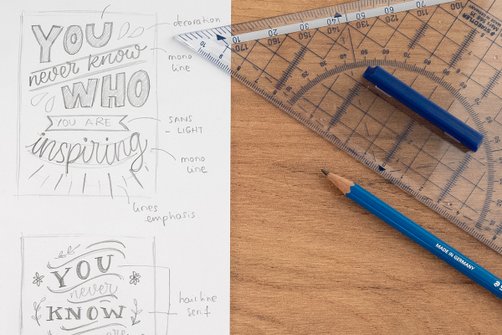
Pencil: A pencil is part of the basic equipment. You can use it to pre-draw individual letters, auxiliary lines and decorative elements. After you have traced and coloured them in with a pen of your choice, you can simply erase the pencil lines. You can also create your hand lettering using only a pencil. In this case, we recommend using a pencil with HB or 2H hardness, as this allows you to create particularly fine lines.
You can find these products for hand lettering at STAEDTLER
Brush pens
► Main area of application:
Brush lettering
Watercolour double fibre-tip pen with brush tip 3001
- Line width: Flexible brush tip: approx. 1.0–6.0 mm/fine tip: approx. 0.5–0.8 mm
- Number of colours: 36
Metallic brush pens 8321
- Line width: approx. 1.0–6.0 mm
- Number of colours: 10
Pigment brush pens 371
- Line width: variable
- Number of colours: 36
Fineliner & fibre-tip pens
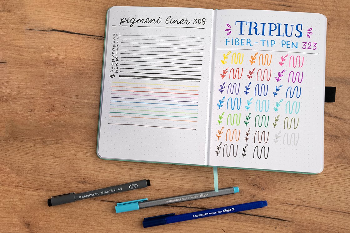
► Main area of application:
Monoline, faux calligraphy, serif/sans serif
pigment liner 308
- Line width: approx. 0.5 mm (black is available in 12 line widths)
- Colours: 13
triplus fineliner 334
- Line width: approx. 0.3 mm
- Number of colours: 60
triplus color fibre-tip pen 323
- Line width: approx. 1.0 mm
- Number of colours: 26
Additional materials
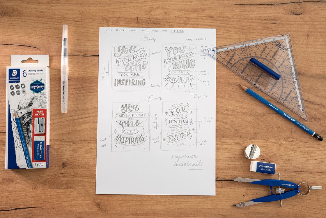
► Main area of application:
All hand lettering techniques
Drawing pencil Mars Lumograph 100
Eraser Mars plastic 526 50
Compass Mars comfort 556
Ruler 568
Water brush 949
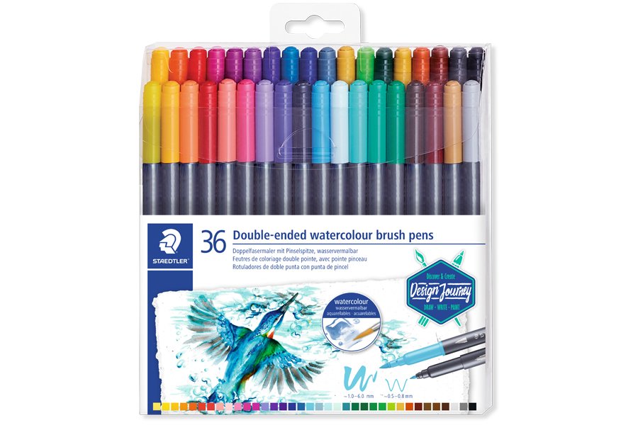
Wallet containing 36 double-ended watercolour brush pens in assorted colours
Buy online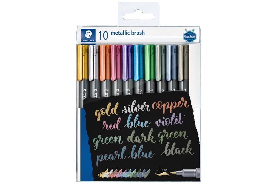
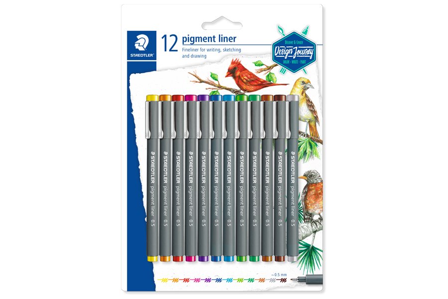
Blistercard containing 12 pigment liner in assorted colours (yellow, orange, red, fuchsia, violet, blue, light blue, light green, green, light brown, brown, grey), line width approx. 0.5 mm
Buy online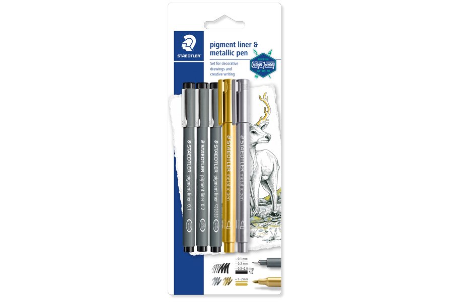
Blistercard containing 3 pigment liner black in assorted line widths (0.1, 0.2, 0.3-2.0) and 2 metallic pen 8323 gold and silver
Buy online
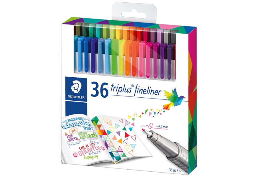
Cardboard box containing 36 triplus fineliner in assorted colours
Buy online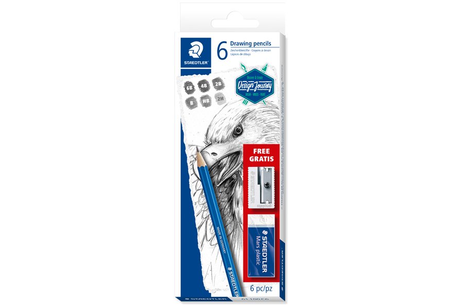
Cardboard box containing 6 drawing pencils in assorted degrees, 1 eraser and 1 metal sharpener
Buy online

The Design Journey Art Class is brought to you by STAEDTLER UK in partnership with Crafty Arts, our online retail partner.
Crafty Arts are a family Arts & Crafts business, offering a wide range of art supplies, as well as tutorials and tips, so you can be creative daily.
Get everything you need for all of the Design Journey Art Classes exclusively through Crafty Arts!
Other materials required:
- Smooth paper: Smooth paper such as marker paper is best suited for hand lettering. Thanks to the smooth surface of the paper, the tip of your brush pens does not fray and glides beautifully over the paper. Paper with a thickness of 80–100 g/m² is suitable for practising, while a thickness of 180–200 g/m² is better for your final artwork. Dotted paper can also make practising easier. If you want to incorporate watercolour effects into your lettering, you should definitely use watercolour paper.
- Pencil: It is best to use a HB or 2H pencil for the preliminary drawing of your hand lettering and not to press too hard so that you can erase the lines easily later. A softer grade of hardness (e.g. a 2B pencil) is also suitable for copying from templates.
- Eraser: You will definitely need an eraser for hand lettering. Whether for touching up your preliminary drawing or erasing your guide lines.
- Ruler: A ruler is not only helpful when drawing your auxiliary lines but also when creating your compositions. Aligning your lettering work straight on the paper significantly increases the visual appeal.
- Compass: A compass can also be a valuable tool for composing and decorating your lettering projects.
The most important hand lettering techniques
BRUSH LETTERING
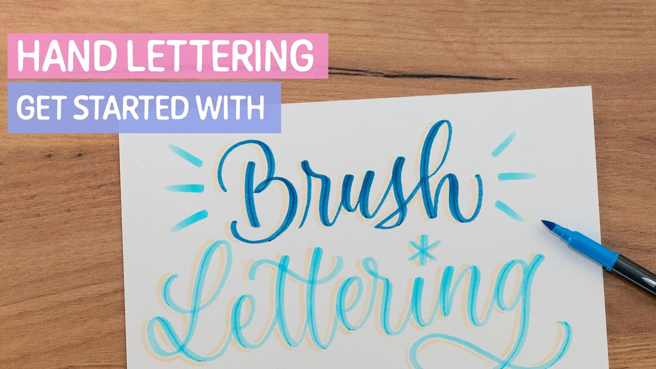
Brush lettering is one of the most popular forms of hand lettering. Brushes and brush pens are must-have equipment for brush lettering. A wide variety of lettering is created depending on the strokes used: Upstrokes are thin lines, downstrokes are thick lines. Below we explain how to successfully do brush lettering.
FAUX CALLIGRAPHY
For faux calligraphy, use a conventional fineliner, a gel roller or a fibre-tip pen. The letters are drawn to give the impression that you have written them with a brush pen or a paintbrush. Discover the most important tips on the subject of faux calligraphy below.
SERIF / SANS SERIF
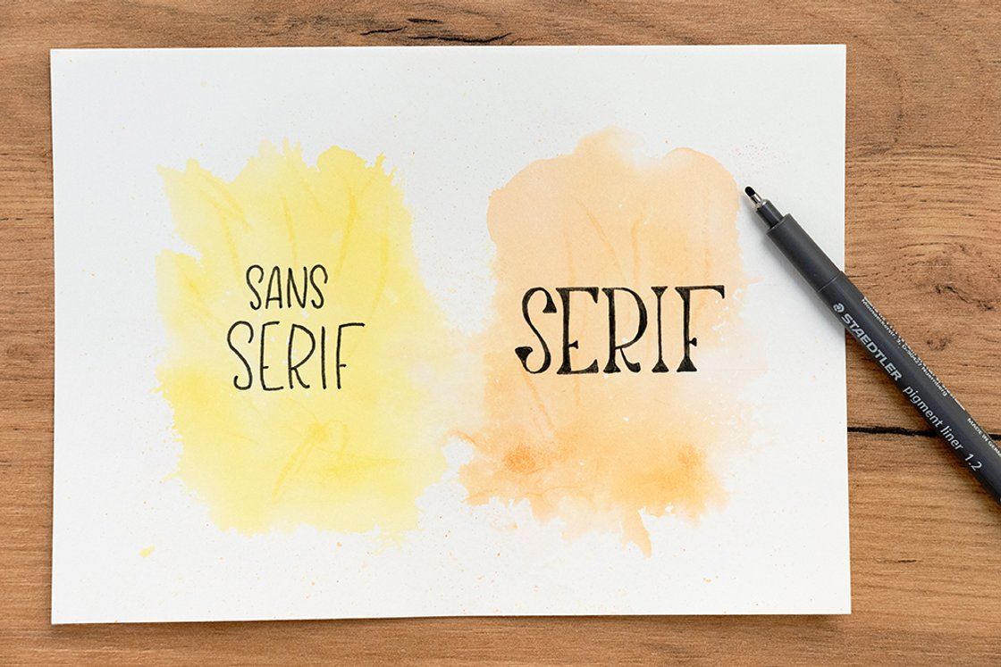
Serif fonts are fonts where the letters have small lines attached to the end, they are typically more traditional looking. Fonts without serifs are referred to as sans serif or fonts without small lines attached. As the opposite of serif fonts, they appear minimalist and modern. Here you will learn how to successfully implement both font design forms.
Serif / sans serif
MONOLINEAR
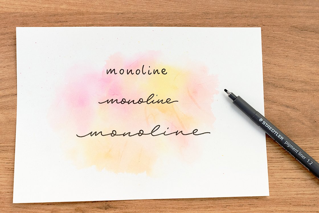
In monoline fonts, all letter elements have the same width. Both upward and downward strokes are characterised by the same line width. Even spacing between the letters is also an important element of monoline fonts. Click here for our monoline crash course.
The term calligraphy stands for the art of beautiful writing. Lower-case and upper-case letters are written in pen and ink.
Typography refers to the art and study of writing. This refers to the optimal presentation and aesthetic design of legible print products.
Hand lettering technique “Brush lettering”
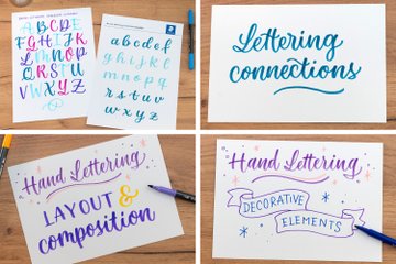
In this video, we show you what materials you need, introduce you to the most important techniques and show you how to practice using lettering exercise sheets. We are using our brush pen 3001 for this mini course, since the firmness of its brush tip makes it easier for beginners to get started. You can create and download your own exercise sheets in the Hand Lettering Creator or draw your own grids using a ruler and pencil. Of course, you can also download our ready-made templates:
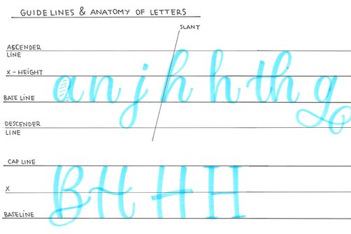
First, let’s look at the auxiliary lines. The letter rests on the base line (BASE LINE). Most lower-case letters are located between the baseline and the X-height (X-HEIGHT), such as a, c or n. Some letters extend beyond the baseline up to the ASCENDER LINE (e.g. b, d, l or h). Some letters extend to the bottom line (DESCENDER LINE) (e.g. g, j or y).
You can draw another line for capital letters – this is often just as high as the ascender line. If you lay out this grid, all letters should follow it in order to achieve consistent proportions.
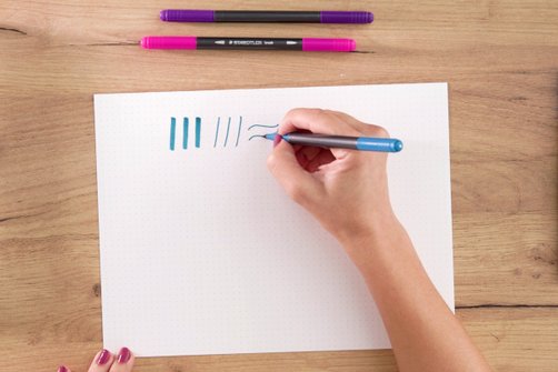
As you can see, brush lettering uses thin and thick lines to form letters. Downward strokes are thick and are achieved by increasing the pressure on the tip of the brush. Upward strokes are thin lines and are achieved by applying hardly any pressure. Horizontal lines are also thin. Practice drawing up and down strokes – with the help of our template.
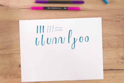
Each letter consists of different basic strokes. These are drawn without setting down the pen. This means that you apply more pressure in some places and reduce it in others. Do not change the way you hold your pen – just adjust the amount of pressure. Here you can see the basic strokes that make up almost all lower-case letters. Practice these strokes and get a feel for their direction, since this will determine the width of the lines.
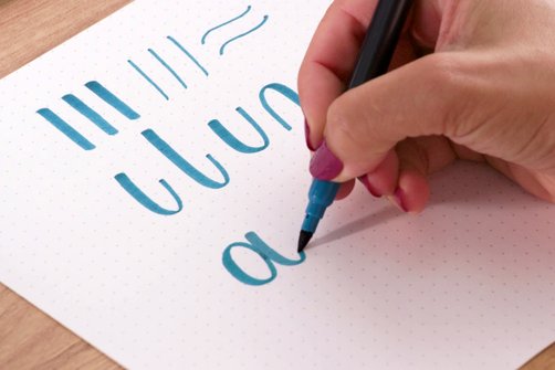
Now it’s time to connect the lines with one another to create letters. For example, you can start with an oval, then raise the pen and draw a downward stroke to the right of it, creating an “a”. Before you start connecting letters, you should first practise drawing each letter individually. You can find out how to create all the other lower-case and upper-case letters by following the instructions in these two hand lettering alphabet exercise templates:
By the way: You can find out more about practising alphabets and whole words on this page. You can also create many more practice templates in different styles in our Hand Lettering Generator.
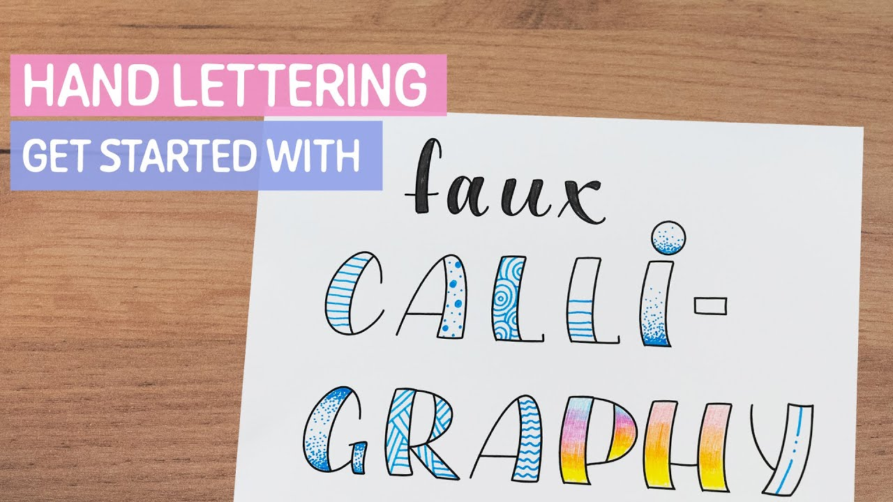
Hand lettering technique “Faux Calligraphy”
Do you want your hand lettering artwork to look like you created it using brush lettering – but you don’t want to use a brush pen? In contrast to brush lettering, this requires a pen with a firm tip. Pencils, fibre-tip pens or fineliners.
Our tip: Before starting with faux calligraphy, it’s best to familiarise yourself with brush lettering so that you know where to place your faux calligraphy lines.
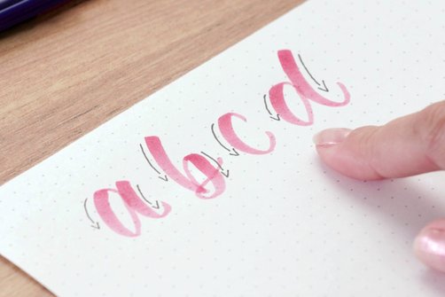
The broad downstrokes are very important for faux calligraphy. A double line is drawn in place of each downward stroke.
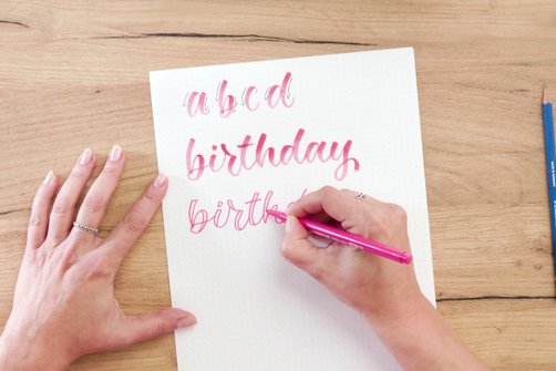
As an example, let’s draw the word “birthday” together in faux calligraphy style. First write the word normally with transitions. Now draw a second line wherever you have drawn a downward line.
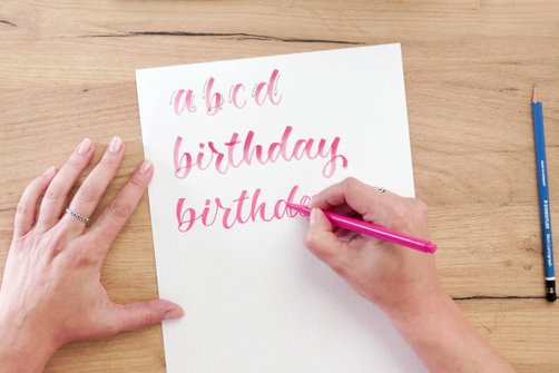
The lines cross at each letter with a loop (e.g. b or y). If you colour your faux calligraphy words with hand lettering pens, that’s not an issue.
However, if you don’t want to colour them in, you should use a pencil first. Then trace the lines with a fineliner or fibre-tip pen (except for the cross lines) and finally erase the cross lines.
11 decorative ideas for your faux calligraphy
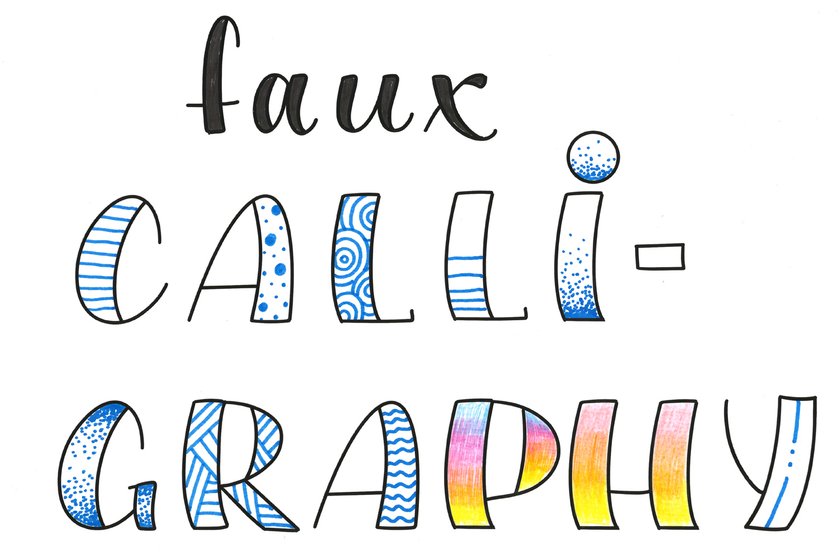
In the following illustration, you can see 11 decorative ideas to embellish your faux calligraphy. How about horizontal lines, polka dots or a circular pattern? You can also decorate isolated parts of your letters and, for example, draw horizontal lines that end in the middle or paint dot shading that tapers off towards the top or in the middle. A crossed pattern or decorative waves can be just as interesting as (rainbow) colour gradients. Ultimately, you can let your imagination run wild and, for example, draw two dots and two lines in your letters.
Hand lettering technique “Serif / Sans Serif”
For both serif and sans serif lettering, you can use a pencil, fineliner or, like us, a triplus fibre-tip pen. Each font is initially a sans serif font and comes in print format, which makes it easy to read. Sans serif fonts are ideal if you want to write longer sentences. You can also add serifs afterwards. Then each letter is provided with so-called “little feet” – while sans serif looks modern, serif fonts look playful or elegant, depending on the type of serif you draw.
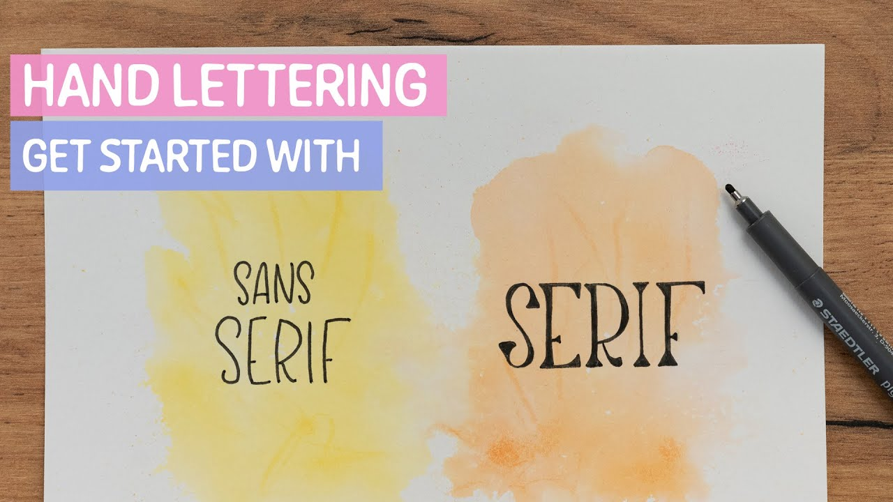
We recommend practising both styles and using both sans serif and serif fonts in your compositions. This allows you to emphasise important words or move filler words such as “and” and “or” into the background. But sans serif doesn’t have to be boring: by combining lower-case and upper-case letters, every word becomes eye-catching!
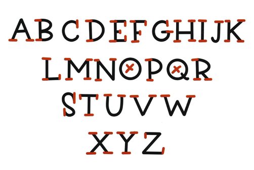
The position of the serifs are always the same. Here, we have detailed where to draw them.
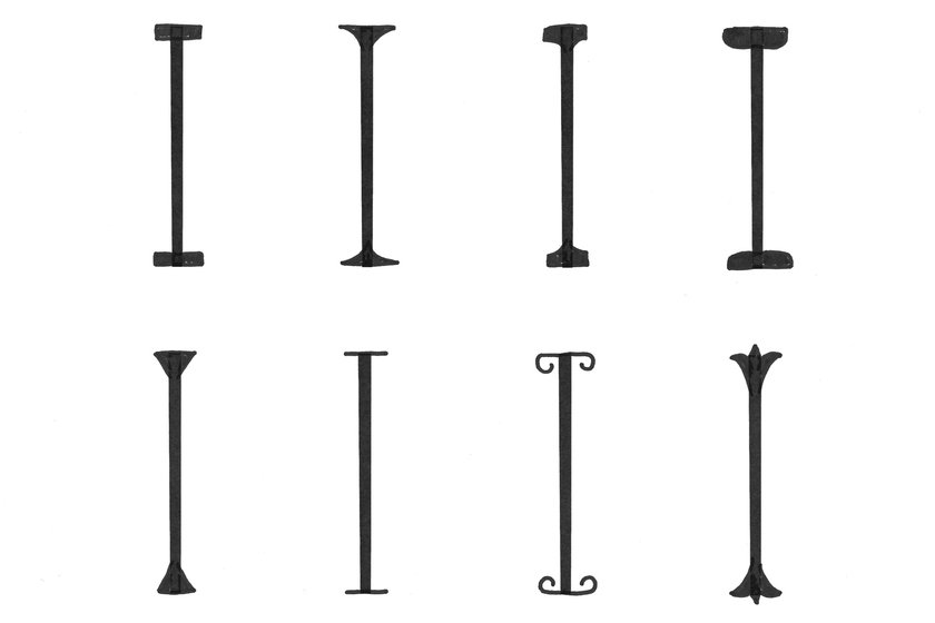
8 different serif styles
In the following illustration, we present 8 different serif styles. Serifs can be simple and angular, elegant or discreet. You can provide letters with rounded serifs or give the serifs a more triangular look. A simple stroke is the simplest version of serifs. But there are also playful, unusual styles that give the letters a “circus” look.
Hand lettering technique “Monoline”
Would you like to draw your characters with a puristic and modern touch? Then take a pen with a firm tip – a pencil, a fineliner or another pen. In this example, we are using a triplus fibre-tip pen.
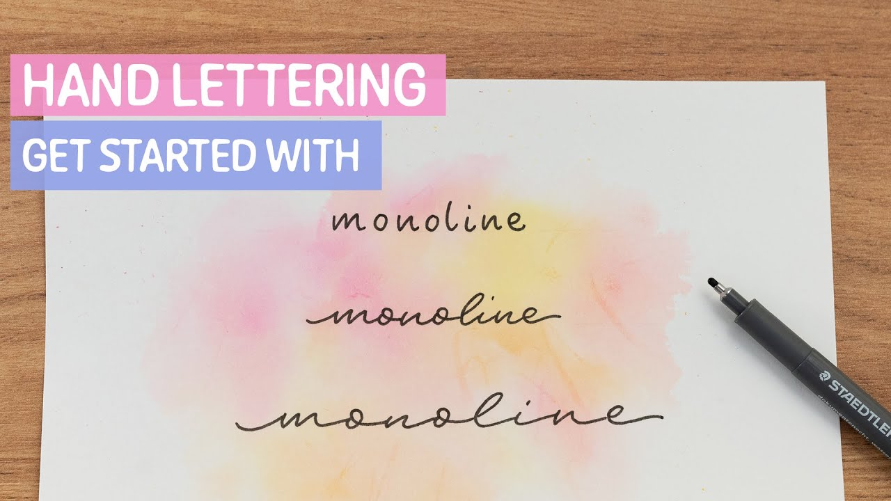
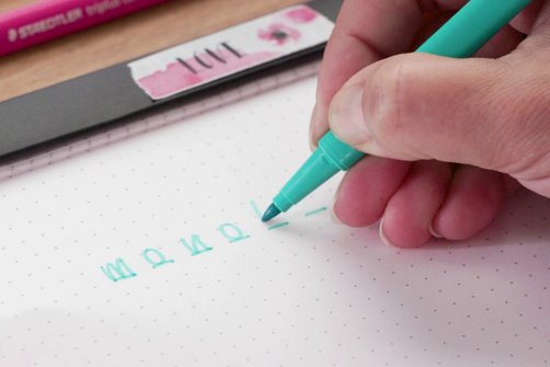
Here, we show you how to create a harmonious monoline lettering. With monoline, it is important that the space between the letters remains the same. We therefore draw in place holders – preferably with a pencil so that they can be erased afterwards. Let’s practise the word “monoline” together. Since it consists of eight letters, we draw eight place holders. Each place holder is assigned to a letter. First, we write the word “monoline” without connections. Each letter should have the same height and spacing so that the overall look is harmonious.
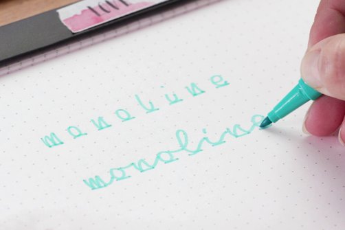
Now we write the word “monoline” with connections. This makes the word look as if you had drawn it with a single line.
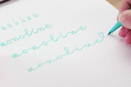
Or you can arrange the place holders with larger spacing, thus pulling letters in the the word “monoline” a touch further apart. The next steps are the same as in the previous two cases. To top it off, you can use decorative elements to put special emphasis on the letters. Example: the letter E, embellished with a small heart. To ensure that the first letter also matches this playful element, you can add a squiggly line to the letter.
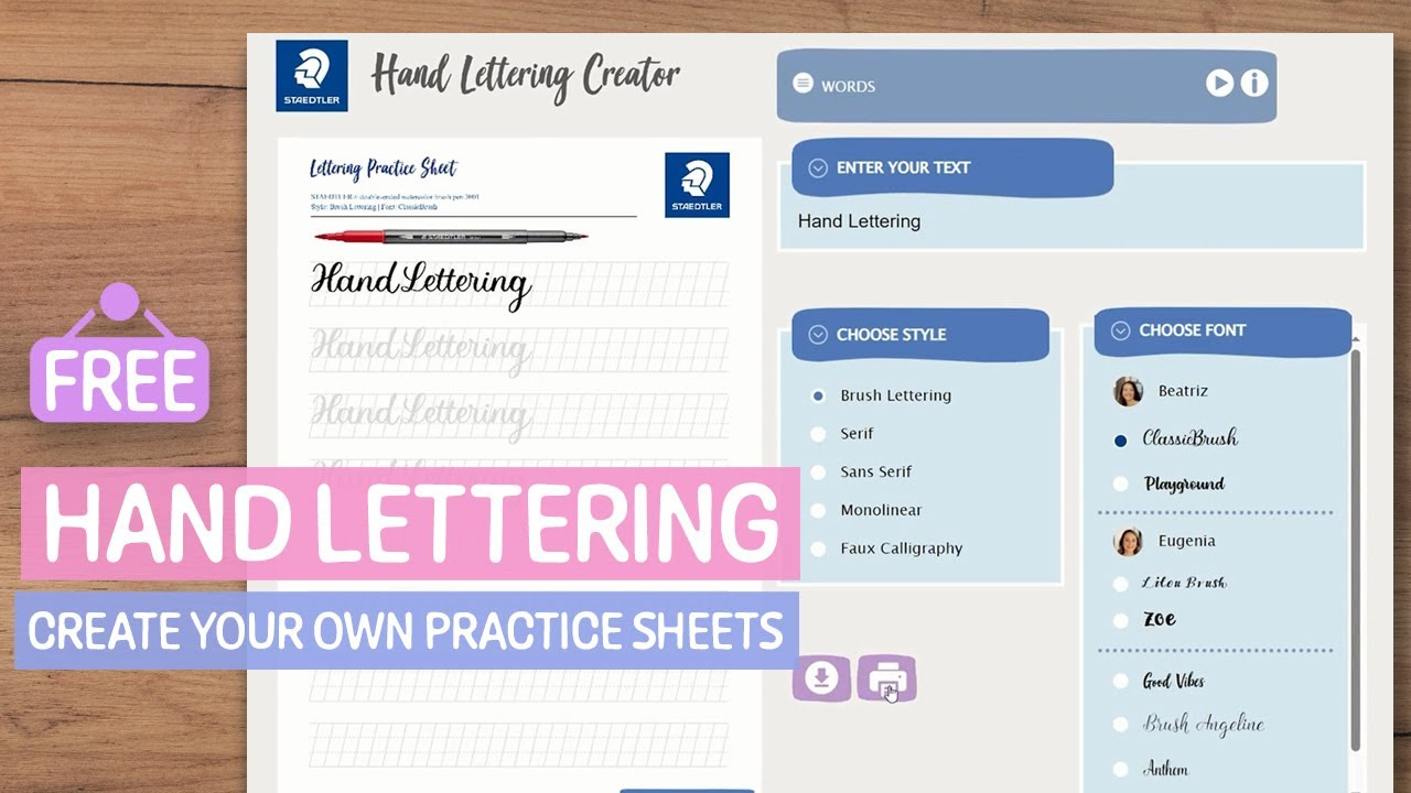
Do you want to know how you can use monolines creatively in hand lettering? In our Hand Lettering Creator, you will find individual practice sheets as well as some ideas for creative letterings!
Learn hand lettering with the creator from STAEDTLER
Want to take your hand lettering skills to the next level? Then use our Hand Lettering Creator – a tool that generates practice sheets for alphabets, basic strokes and words as well as providing various templates.
Frequently asked questions about hand lettering materials and techniques
The term “lettering” refers to various forms of font design, including hand lettering, bounce lettering, faux calligraphy and brush lettering.
Does your materials box already have all the most important pens, brushes and hand lettering colours? Then all that’s missing is the right paper. The choice of paper depends on the pens you use. Do you use brush pens or felt-tip pens? Then you should go for smooth paper. If you decide to use a pencil, ballpoint pen or fineliner, you can use both plain paper and conventional printing paper. In terms of paper thickness, you should use paper with a grammage of 80–100 g/m² for practising and 180–200 g/m² for your final artwork. Do you love watercolour pens and watercolour brush pens? Watercolour paper with a grammage of 250 g/m² or more is the best choice for hand lettering with watercolour media.